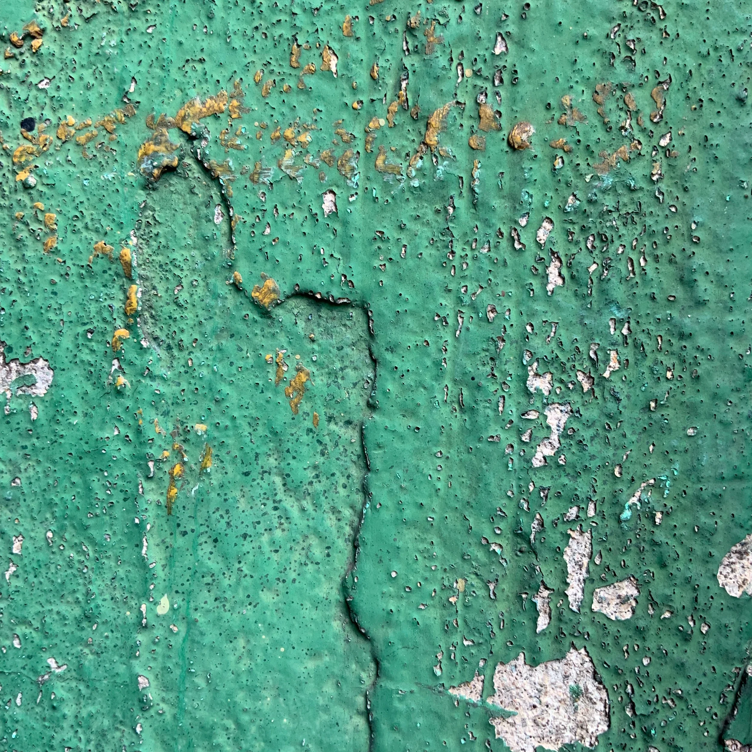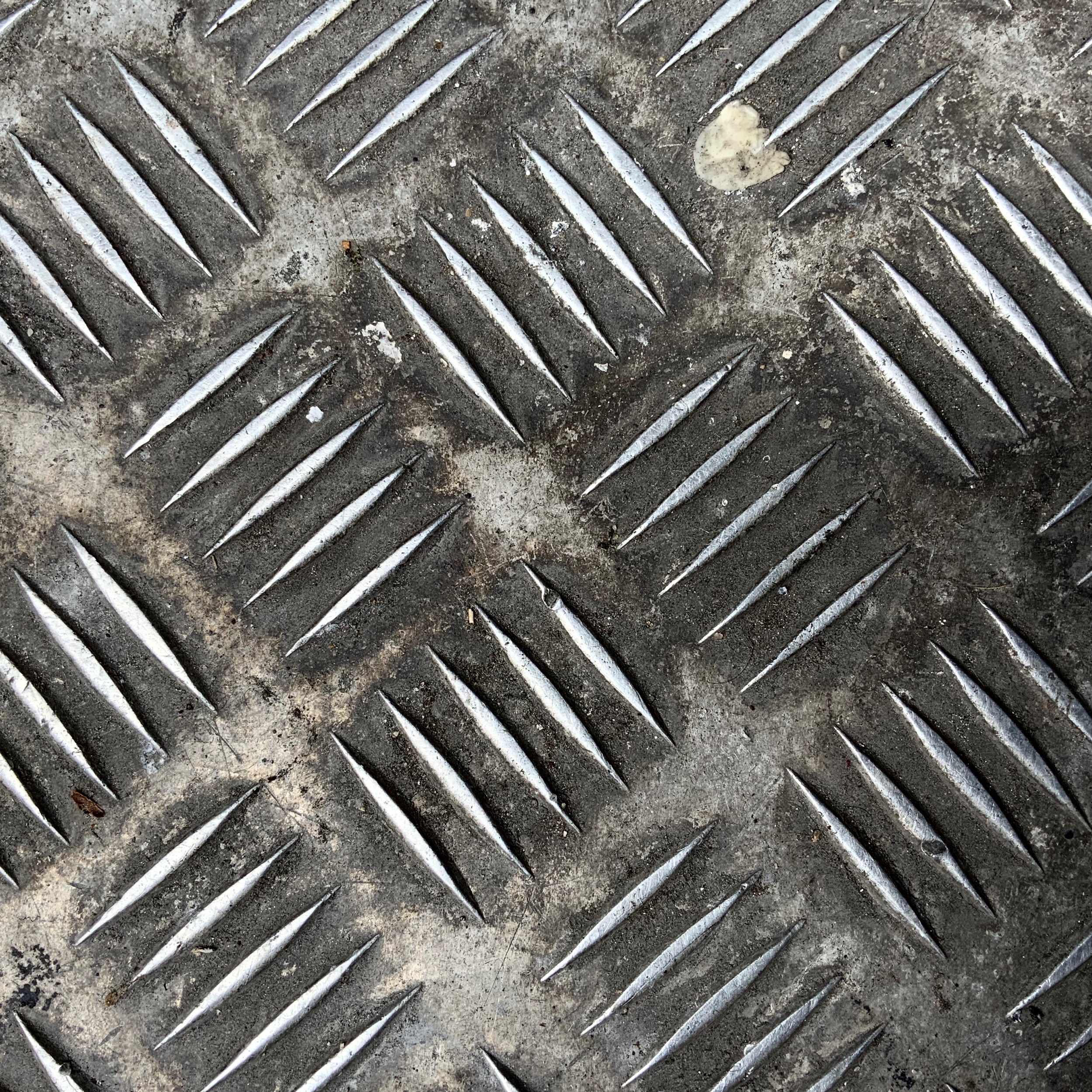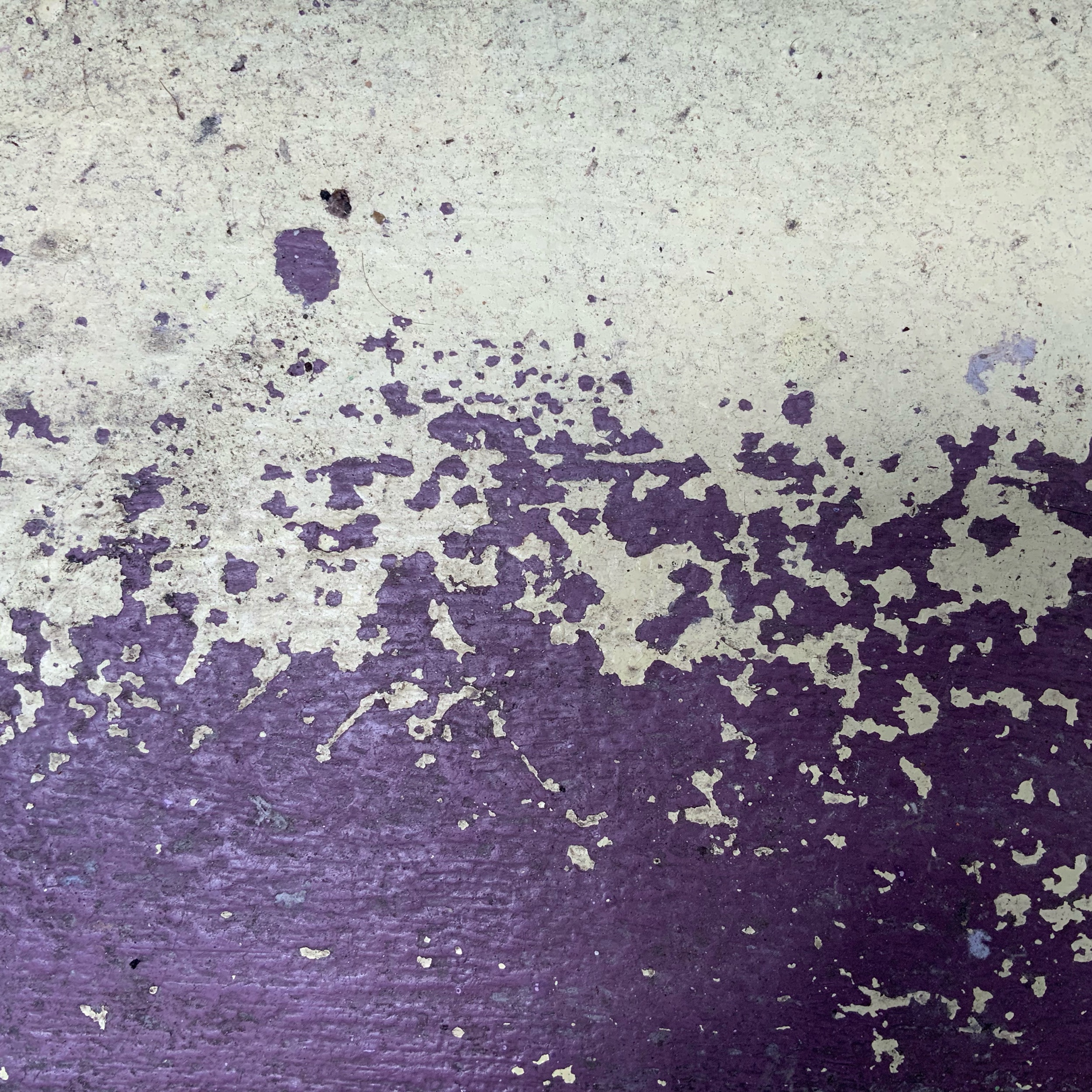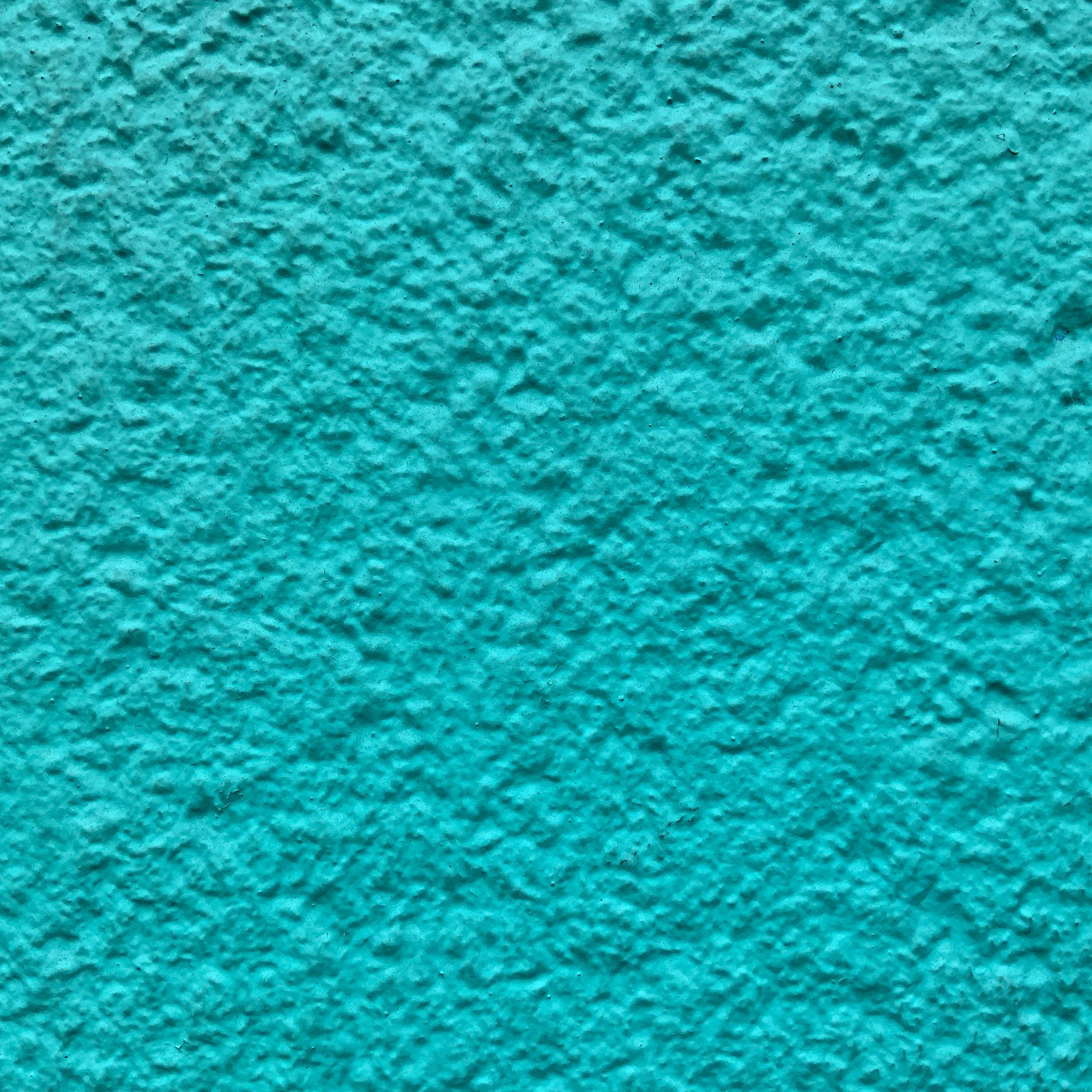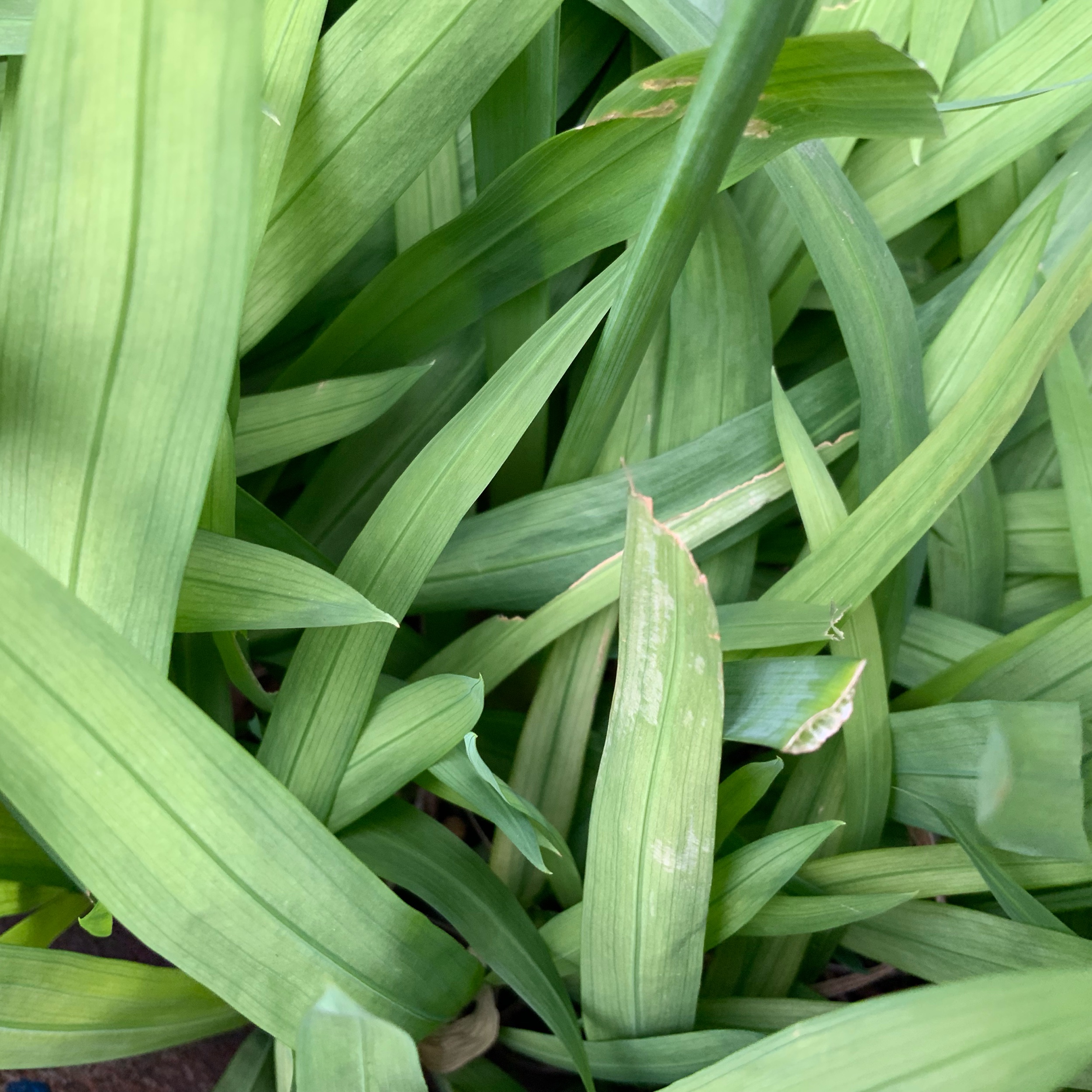
I’m a big fan of textures! They’re like magic that makes your images feel real. Textures are super important in how people connect with your work. They give it a sense of touch that’s missing in flat pictures. By using different textures, I can make people feel like they’re actually there. The roughness of a stone or the softness of a fabric can almost be felt through the image. It’s like a little sensory experience!
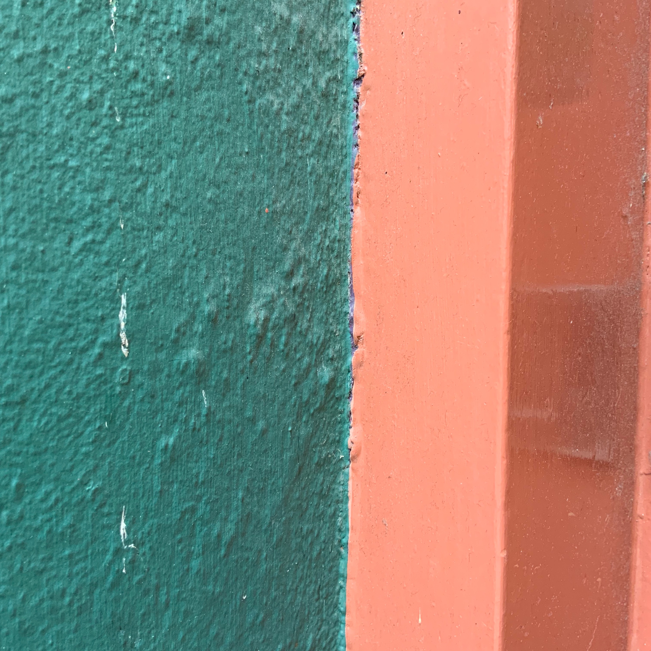
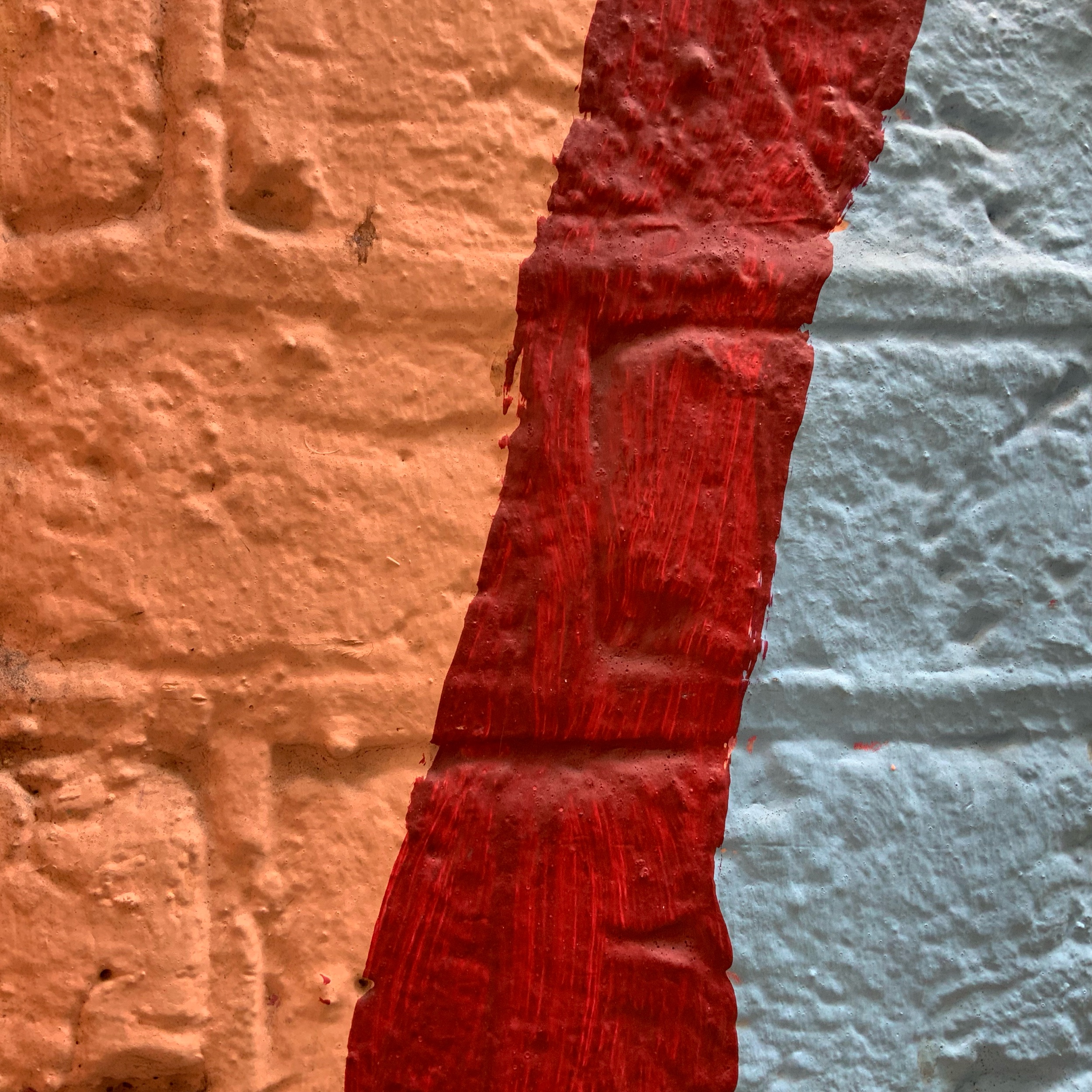
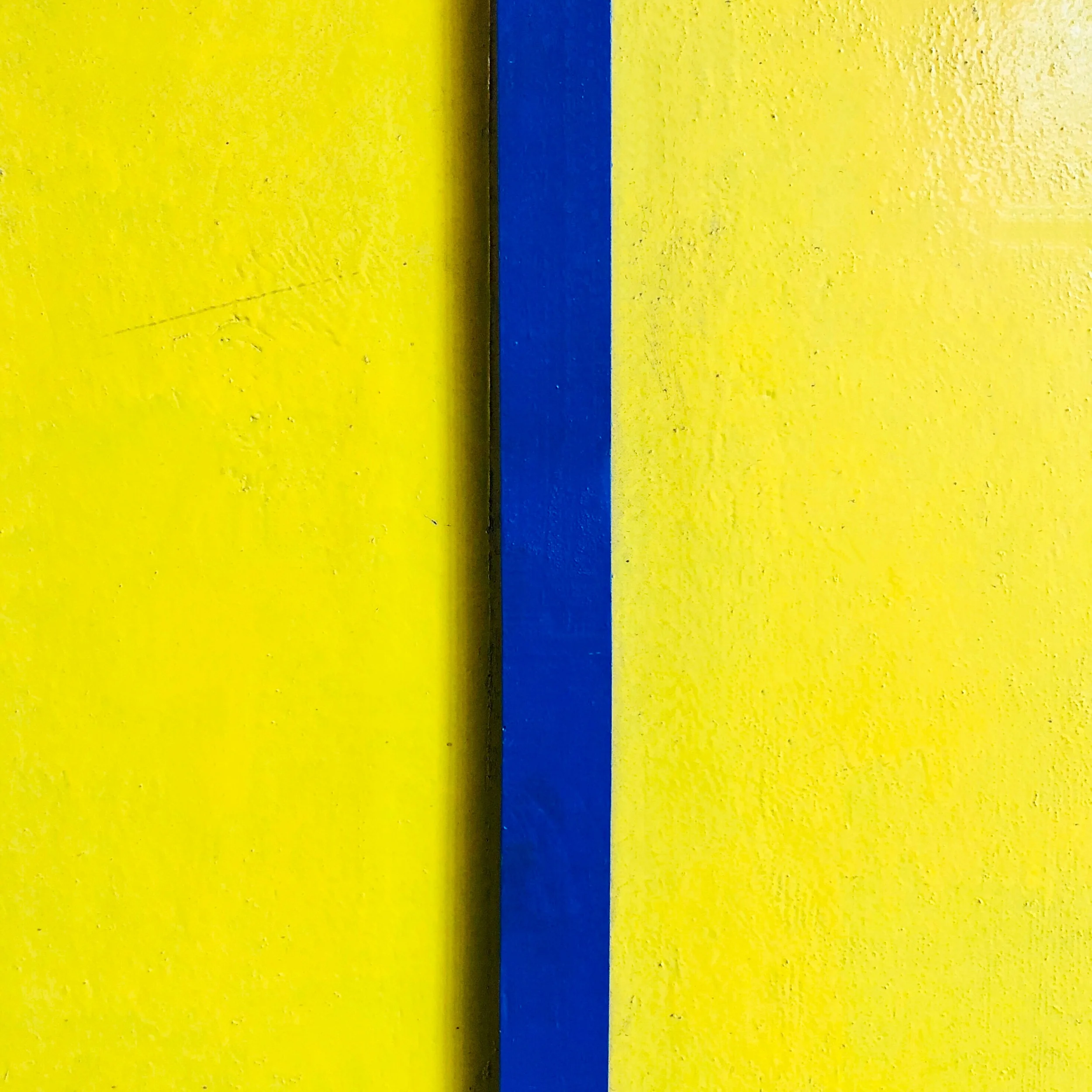
Colors are another way to make textures pop. Different shades can make a texture look even more interesting, for example, a bright color can make a rough surface look even rougher, while a soft color can make a striking texture look softer. This is all part of my creative process and I love experimenting with how colors can change how people see textures.
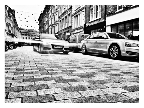
Shapes and patterns are also important for adding depth to my work. Textured shapes can make an image feel like it’s moving or flowing, for instance, the waves in the ocean or the angles of a building can all add to the overall look of the piece. Patterns, whether they’re the same or different, can make the eye wander around the image and discover new things.
Contrast is also a big part of how textures show up in my work. High contrast between different textures can make them stand out and catch the eye. Low contrast can make textures blend together and look smooth.
By combining textures, colors, shapes, patterns, and contrast, I can create images that are not only visually appealing but also feel real. Each texture is like a little invitation for the viewer to get closer and explore the artwork.
So here is a challenge for you, over the next 24 hours try to capture 8-10 textures that inspire you.